


While knocking out the background behind the text can create a sharp contrast and clarity, it risks white gaps due to misregistration. Overprinting – placing the text directly on top of the background – ensures there are no white gaps.
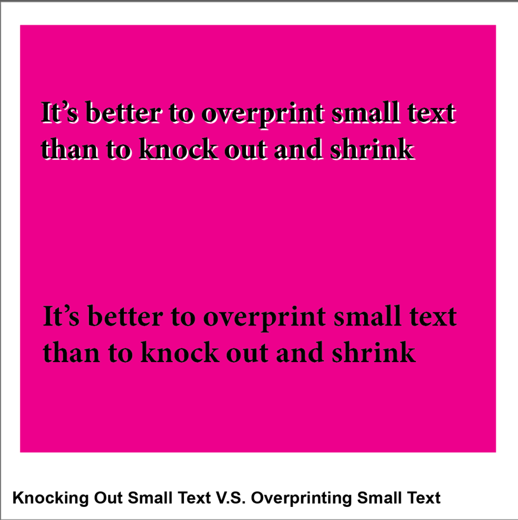
Knockout
- Using the rectangle tool, create a square and give it 100% magenta fill
- Using the type tool, type “It’s better to overprint small text than to knock out and shrink” and give it 100% black fill, layering it over the magenta box
- Convert the text to an outline (shift + command + o)
- Copy the text
- Go to the Window menu and click the Pathfinder panel
- Click the “Minus-front” button to knock out the text, allowing the white of the art board to show through
- Layer the black text on top of the knocked-out portion and offset to create a white gap, demonstrating misregistration
Overprint
- Using the type tool, type “It’s better to overprint small text than to knock out and shrink” and give it 100% black fill
- Convert the text to an outline (shift + command + o) and place on top of the magenta box
Go to the View menu and select Overprint Fill.
Come back later for Part 9, Spread V.S. Choke on Small Text with High Contrast!
Leave a Reply